Solution - Compensated Risk#
Data#
Consider the excess return data in data/spx_returns_weekly.xlsx.
1.#
For each stock, calculate the (annualized) mean as well as the following measures of risk
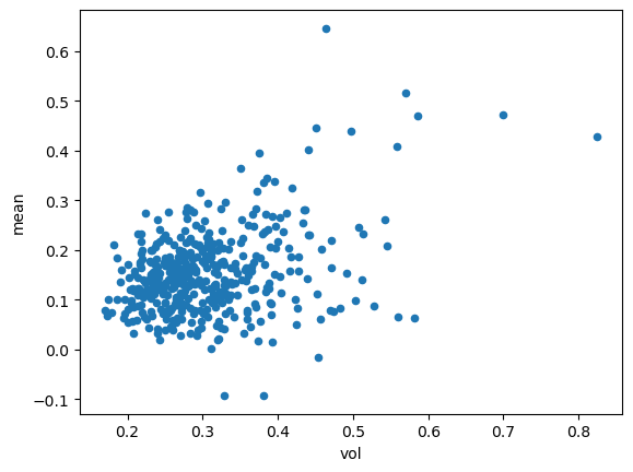
volatility
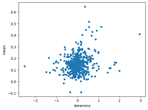
skewness
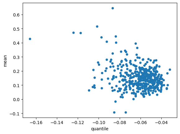
5th quantile return
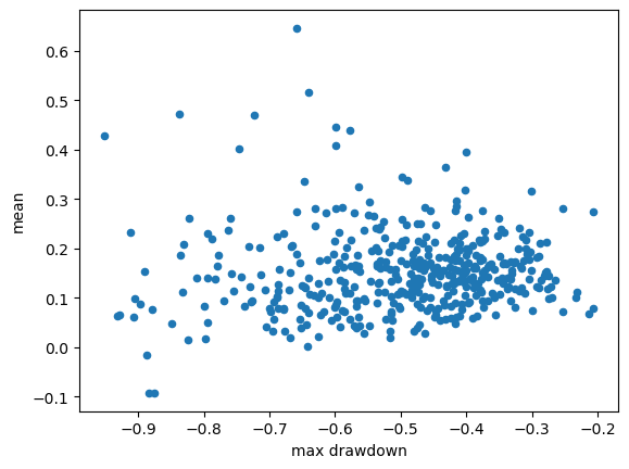
max drawdown
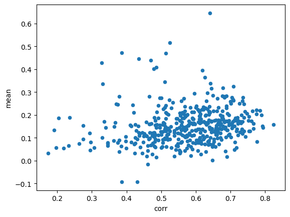
correlation to SPY
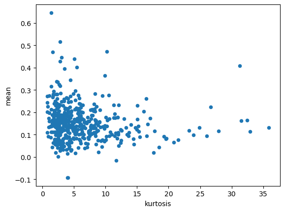
For each risk measure, make a scatter plot of stocks risk on the horizontal axis and the stock’s mean return on the vertical axis.
2.#
Do any of these scatterplots show strong evidence of a relationship between risk and return?
1.1.#
import pandas as pd
import numpy as np

from cmds.portfolio import maximumDrawdown
INFILE = "../data/spx_returns_weekly.xlsx"
FREQ = 52

SHEET = 's&p500 rets'
rets = pd.read_excel(INFILE,sheet_name=SHEET).set_index('date')
SHEET = 'benchmark rets'
TICK = 'SPY'
TICK_RF = 'SHV'
facs = pd.read_excel(INFILE,sheet_name=SHEET).set_index('date')
spy = facs[[TICK]]
QUANTILE = .05

stats = pd.DataFrame(index=rets.columns,columns=['mean','vol','skewness','kurtosis','quantile','max drawdown'],dtype=float)
stats['mean'] = rets.mean() * FREQ
stats['vol'] = rets.std() * np.sqrt(FREQ)
stats['skewness'] = rets.skew()
stats['kurtosis'] = rets.kurtosis()
stats['quantile'] = rets.quantile(QUANTILE)
stats['max drawdown'] = maximumDrawdown(rets)['Max Drawdown']
stats[f'corr'] = pd.concat([rets,spy],axis=1).corr().loc['SPY']
for col in stats.columns[1:]:
    stats.plot.scatter(y='mean',x=col)
1.2.#
None of the metrics show a strong proportional relationship to historic mean return.
This could indicate that…
historic mean or historic risk are not good indicators of the future.
there is some other risk metric which corresponds better to mean returns.
markets do not efficiently price risk: perhaps is no clear relationship between risk and return.
We will see further evidence for the first and second ideas in other discussions.